- Docs>
- Message>
- Message Template
Message


Message template
This document introduces the types and functions of the message templates used for the Kakao Talk Sharing API and Kakao Talk Messaging API.
To use this function, you must register the platform and domain information in [My Application] > [Platform]. Refer to Register platforms to see how to register a platform.
Overview
The Messaging API allows users to send a message to Kakao Talk friends. To send a message through this API, you need to create a message in a predefined structure. The predefined structure is called Message template. Kakao provides major types of message templates.
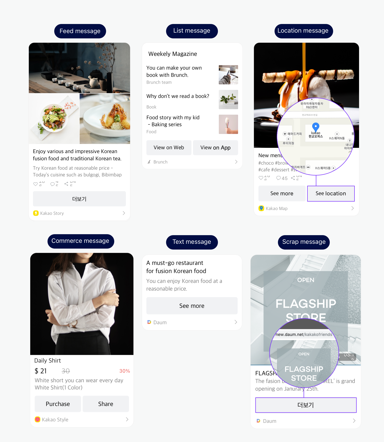
Template types
Kakao provides five types of the default templates to help you configure a message content more easily according to your service's situation. Hear are the examples and usage cases.
| Template | Description |
|---|---|
| Feed | Used to configure a message that contains images and text. You can also add a list of items to the Feed message if using the Extended feed message. When you send a Scrape message, the Feed template sturcture is applied. The Scrape message contains the information of the requested web page that is scraped based on the Open Graph Protocol. Recommendations: You can use this template to share a service news or promotion event. To share a web page only, use a Scrape message. |
| List | Used to configure a message that contains one or more contents on a vertical list. Each list has an image and text. Recommendations: You can use this template to introduce multiple news or product information in a single message. |
| Location | Used to configure a message that contains location information such as address. When a user clicks the location information button in the message, the use can check the detailed location information through Kakao Map Recommendations: You can use this template to share a grand opening news or introduces some menus or products that a store sells with its location. |
| Commerce | Used to configure a message that contains product price and its description. This template shows detailed product information (regular price, discount price, discount rate) but cannot contain long texts as many as the Feed template does. Recommendations: You can use this template to notify users of promotion or discount events for the products that the service sells. |
| Text | Used to configure a message that contains text only. Recommendations: You can use this template to send a simple text message or when you need to input a long text up to 200 characters in a message. |
| Calendar | Used to configure a message that includes a button to add a public event or a subscribed calendar to a user's calendar. You can send a Kakao Talk message from an app that is connected to a Kakao Talk Channel by passing a public event ID or a subscribed calendar ID. IMPORTANT: To obtain permission for a public event or a subscribed calendar, request permission. Recommendations: You can use this template to encourage users to add a public event to their calendars or subscribe to a subscribed calendar. |
How to use
To configure a message template, you can use either one:
- Default template: Define each message component in
JSONor object format in a predefined structure and pass when requesting to send a message. No registration is required. Default templates are useful when configuring messages according to the users' or the service's situation. - Custom template: Register a message template in [Tools] > [Message Template Builder]. Custom templates are convenient when the contents of the message do not change significantly depending on the user or situation. Custom templates can be updated in the [Message Template Builder] without any update in the client or server.
User argument
The custom template supports the user argument. The user argument is a feature that allows customizing the part of message content with variables. The message content can be configured for targeted users or situations by the user argument. To use the user argument, refer to the steps below.
- Set keys in the
${KEY}format in the custom template.- Only English characters, numbers, and underscore(
_) are allowed.
- Only English characters, numbers, and underscore(
- Pass the value of each key when requesting to send a message. (Example:
{"${KEY}":"${VALUE}"})
Supported method by types
| Message | Default template | Custom template |
|---|---|---|
| Feed | O | O |
| List | O | O |
| Location | O | X |
| Commerce | O | O |
| Text | O | O¹⁾ |
| Calendar | O | X |
| Scrap | O | O²⁾ |
1) Can be configured by editing Feed in the Message template builder
2) Can be configured with predefined keys for scraping in the Message template builder, refer to Scrape message
Components by message type
If you fully understand the types and components of a message template, you can configure your message as you desire effectively with any type of the Messaging API. You can simply use a Text template that consists of text and buttons, a List template that can show the latest news, or a Commerce template that displays product information.
All message templates contain a link to launch the app at the bottom, and you can add one or two buttons containing a path to open the specified web page or app as needed. Depending on the template types, the other components may change.
Each type of message template has different components. You cannot mix up components of different message types in a message because each message type is composed of an object defined according to message types.
To include an image in your message to be sent through the Messaging API, you must pass the path (URL) of an image file in the request. You cannot use the path of the image file stored on a device. The image file's size must be less than 5 MB.
To help you develop more conveniently, Kakao supports the Uploading image API with which you can store your images in the Kakao server for 100 days and use the image file path when sending a message. To see how to use the Uploading image API, refer to the development guide for the corresponding platform you work with.
Let's see the components for each message type you should know when registering message templates or configuring a message in your code.
- Feed message
- List message
- Location message
- Commerce message
- Text message
- Scrape message
- Calendar message
- Common components
Because this documentation describes message components based on REST API, the names of classes and fields for each common component provided by the Kakao SDK are different.
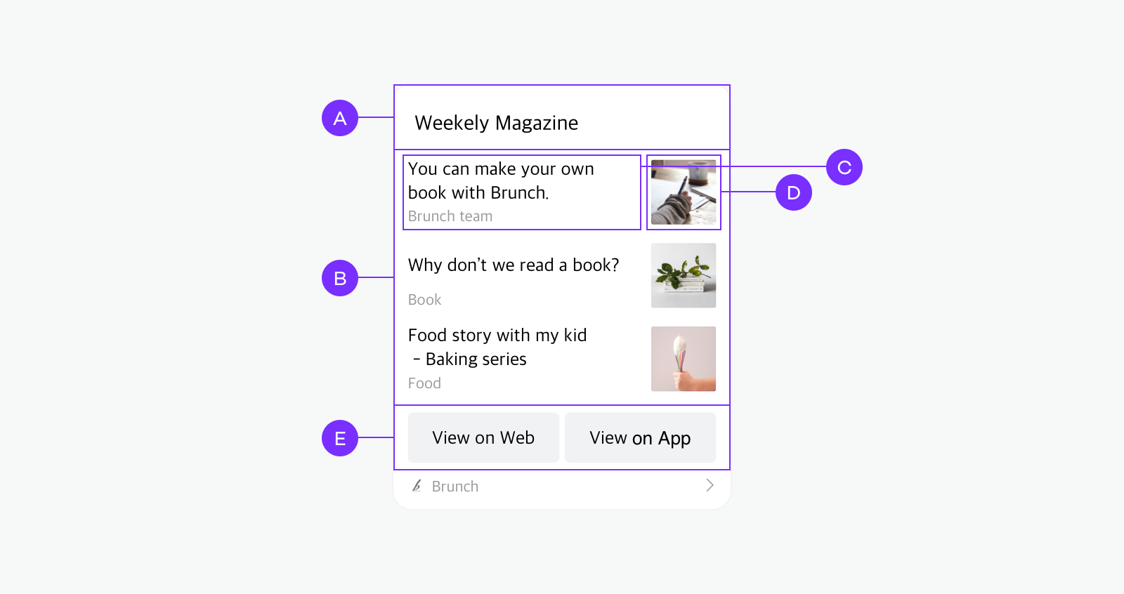
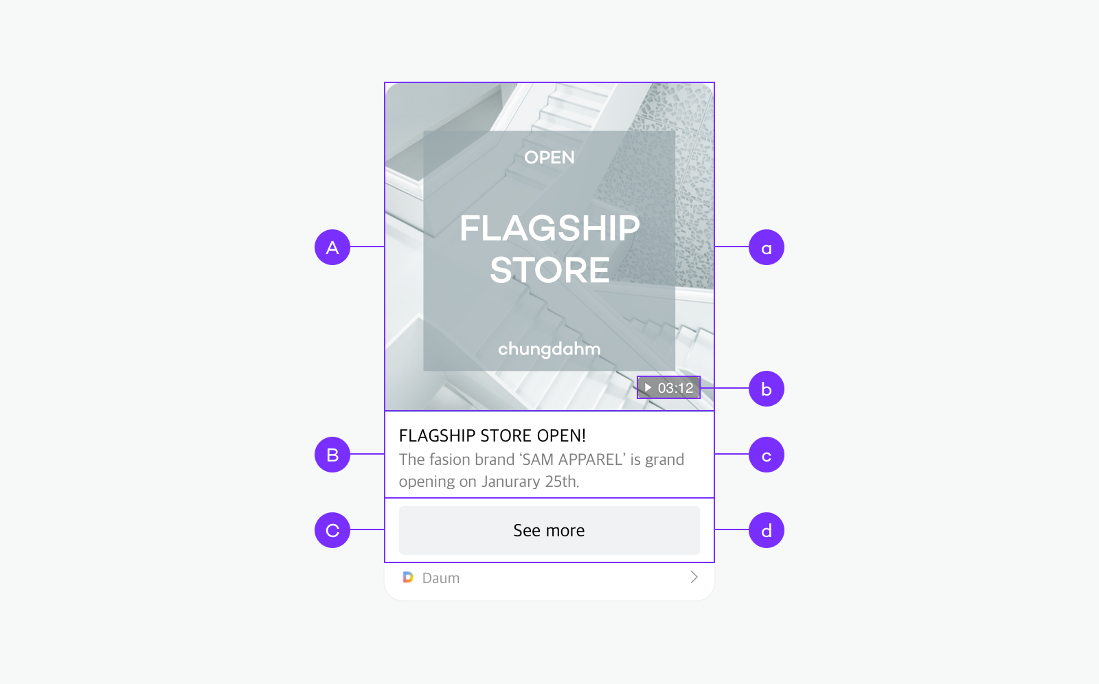
Feed message
The Feed template, provided as the default template, consists of a piece of content and a button as a default. Configure the default Feed message through template_object. You can add social information or one more button as needed.
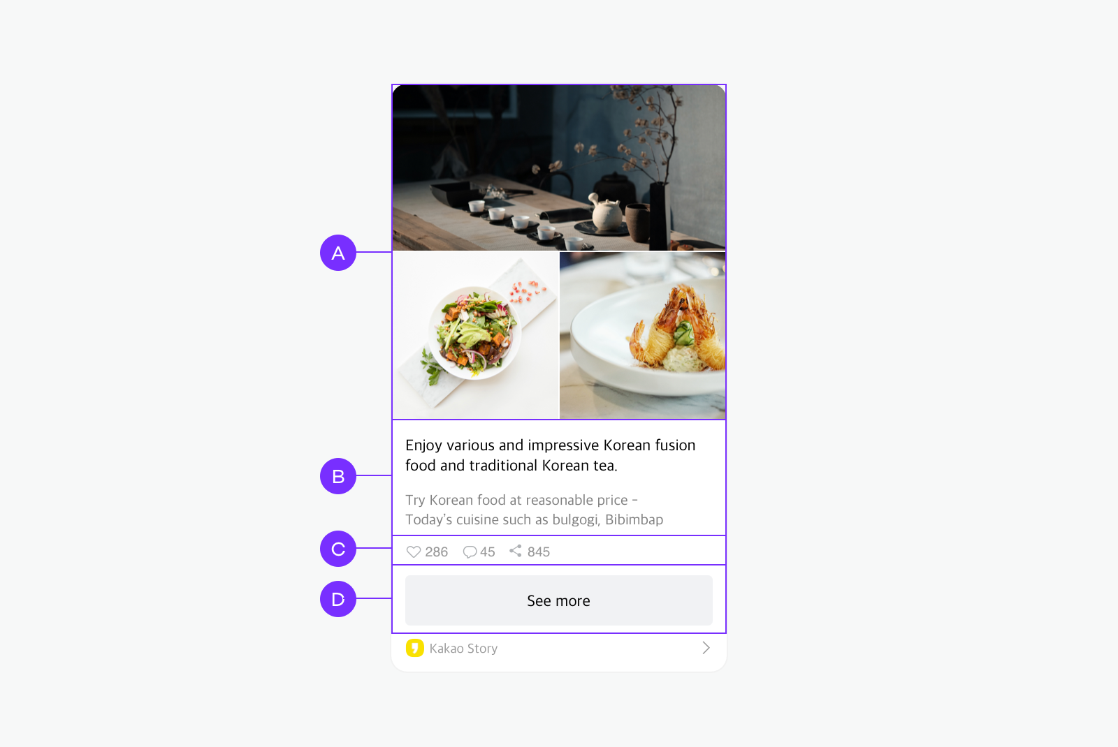
🅐 Image: You can add an image with a minimum size of 400x400 pixels. If you configure a custom template in the Message template builder, up to three images are allowed. For more details, see Message template builder > Image. 🅑 Text: You can enter up to two lines of title and two lines of description. 🅒 Social: You can register five social information but only up to three items are displayed and sorted with this priority: [Like] > [Comment] > [Share] > [View] > [Subscribe]. 🅓 Button: You can add up to two buttons. 8 characters or less are recommended for the button name.
Extended feed message
You can use the extended version of a feed message by adding multiple items and their information. You can use this message type for a receipt, menu, or product description.
To use the Extended feed message, add the item_content object inside template_object. The rest components (🅐 to 🅓) are the same as the Feed message.
🅔 Profile/Header: You can set the profile information with a profile image or only the text without an image. 🅕 Image item: You can add a specific item name with an image and its category information. Only one Image item is allowed. 🅖 Text item: You can add a list of text items that consists of the item's name and description. Up to five items are allowed. 🅗 Summary information: You can add summary information that consists of Name and Description.
template_object (SDK: FeedTemplate)
| Name | Type | Description | Area | Required |
|---|---|---|---|---|
| object_type SDK: objectType |
String |
Template type. Fixed to feed. |
- | O |
| content | Content |
Main content information of the message. | 🅐,🅑 | O |
| item_content SDK: itemContent |
ItemContent |
Components for the extended version of a Feed message. Required if you configure the Extended Feed Message. |
🅔,🅕,🅖,🅗 | X |
| social | Social |
Social information about the content. | 🅒 | X |
| button_title SDK: buttonTitle |
String |
Used when you want to change the title of the default button ("자세히 보기"). | 🅓 | X |
| buttons | Buttons[]Android,Flutter: List<Button>iOS: [Button] |
List of buttons. Up to two buttons are allowed. Used when you want to change the title and link of a button or add two buttons. |
🅓 | X |
item_content (SDK: ItemContent)
| Name | Type | Description | Area | Required |
|---|---|---|---|---|
| profile_text SDK: profileText |
String |
Text in the Profile or Header area. If profile_image_url is not set, only text is displayed. Character limits*: 27 in a line (16 in Korean) |
🅔 | X |
| profile_image_url SDK: profileImageUrl |
StringFlutter: UriiOS: URL |
Image in the Profile area. | 🅔 | X |
| title_image_text SDK: titleImageText |
String |
Title of the image item. Character limits*: 40 in two lines. (24 in Korean) |
🅕 | X |
| title_image_category SDK: titleImageCategory |
String |
Category of the image item. Character limits*: 24 in a line (14 in Korean) |
🅕 | X |
| title_image_url SDK: titleImageUrl |
StringFlutter: UriiOS: URL |
URL of the image displayed at the right side of title_image_text. Image size: 98x98 pixels on Android, 108x108 pixels on iOS. If the image is not 1:1 aspect ratio, center-cropped. |
🅕 | X |
| items | ItemInfo[] Android,Flutter: List<ItemInfo>iOS: [ItemInfo] |
List of the text items that consists of item and item_op.(Example: [{"item": "item1 name", "item_op": "item1 description"}, {"item": "item2 name", "item_op": "item2 description"}]) Up to five items are allowed. See items: Text item information. |
🅖 | X |
| sum | String |
Name of summary information. Can be used for Total price or amount. (Example: Total) Character limits*: 6 IMPORTANT: Only displayed when one or more item is set and when both sum and sum_op are set. |
🅗 | X |
| sum_op SDK: sumOp |
String |
Description of summary information. Can be used for the total price or amount. (Example: 999,999 USD, $99.99) Character limits*: 19 in a line (14 in Korean) Recommended characters: numbers, decimal numbers to hundredths, period(.), comma(,), currency unit or currency symbol, white space IMPORTANT: Only displayed when one or more item is set and when both sum and sum_op are set. NOTE: Left-aligned by default. If sum and sum_op are set, right-aligned. |
🅗 | X |
*Character limits are calculated on the Android device with resolution 2400 × 1080 pixels (FHD+), and may be different depending on devices.
items: Text item information
| Name | Type | Description | Area | Required |
|---|---|---|---|---|
| item | String |
Item name. Character limits*: 6 IMPORTANT: Only displayed when both item and item_op are set. |
🅖 | O |
| item_op SDK: itemOp |
String |
Item description. Character limits*: 49 in two lines. (25 in Korean) IMPORTANT: Only displayed when both item and item_op are set. NOTE: Left-aligned by default. If sum and sum_op are set, right-aligned. |
🅖 | O |
*Character limits are calculated on the Android device with resolution 2400 × 1080 pixels (FHD+), and may be different depending on devices.
List message
The List template consists of a header title displayed at the top of the message, lists, and a button as a default. Configure the default List message through template_object. You can add a link for each header and content and one more button as needed.
🅐 Header 🅑 List: Up to three items are allowed by default. If you use a custom template, up to five lists are allowed. 🅒 Title/description: You can enter up to two lines of title and one line of description. 🅓 Image: You can add a single image on each list. Minimum size: 200x200 pixels. Maximum file size: 5 MB. 🅔 Button: You can add up to two buttons. 8 characters or less are recommended for the button name.
template_object (SDK: ListTemplate)
| Name | Type | Description | Area | Required |
|---|---|---|---|---|
| object_type SDK: objectType |
String |
Template type. Fixed to list. |
- | O |
| header_title SDK: headerTitle |
String |
Main title displayed at the top of list. Up to 200 characters are allowed. | 🅐 | O |
| header_link SDK: headerLink |
Link |
Link information corresponding to the content of the title. | 🅐 | O |
| contents | Content[]Android,Flutter: List<Content>iOS: [Content] |
List of contents displayed on the list. Two or more contents required. Up to three contents are allowed. |
🅑 | O |
| button_title SDK: buttonTitle |
String |
Used when you want to change the title of the default button ("자세히 보기"). | 🅔 | X |
| buttons | Buttons[]Android,Flutter: List<Button>iOS: [Button] |
Button list. Up to two buttons are allowed. Used when you want to change the button title and link or to add two buttons. |
🅔 | X |
Location message
The Location template consists of address information to display the location on a map and the content object describing the location. Configure the Location message through template_object.
The [View Location] button to show a map is added at the bottom right next to the default button. If users click [View Location], they can see the location address on the switched map screen in the Kakao Talk chatroom.
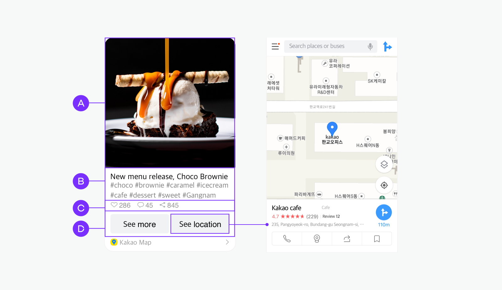
🅐 Image: You can upload only one image. Recommended image size: 800x800 pixels or more. 🅑 Text: You can enter up to two lines of title and two lines of description. 🅒 Social: You can register five kinds of social information but only up to three items are displayed and sorted with this priority: [Like] > [Comment] > [Share] > [View] > [Subscriber]. 🅓 Button: You can add up to two buttons. 8 characters or less are recommended for the button name.
template_object (SDK: LocationTemplate)
| Name | Type | Description | Area | Required |
|---|---|---|---|---|
| object_type SDK: objectType |
String |
Template type. Fixed to location. |
- | O |
| address | String |
Address of location to be shared. (Example: 235, Pangyoyeok-ro, Bundang-gu, Seongnam-si, Gyeonggi-do) |
- | O |
| address_title SDK: addressTitle |
String |
Title used for Map view in Kakao Talk. (Example: Kakao Pangyo Office) |
- | X |
| content | Content |
Content information that describes the location. | 🅐,🅑 | O |
| social | Social |
Additional social information. | 🅒 | X |
| button_title SDK: buttonTitle |
String |
Used when you want to change the title of the default button ("자세히 보기"). | 🅓 | X |
| buttons | Buttons[] Android,Flutter: List<Button>iOS: [Button] |
Button list. Up to two buttons are allowed. Used when you want to change the button title and link or to add two buttons. |
🅓 | X |
Commerce message
The Commerce messages consist of an image, product information, content, and buttons. With the Commerce template provided as a default, you can contain only one product information with one button. Configure the default Commerce message through template_object. If you want to show multiple product information, you must configure a custom message.
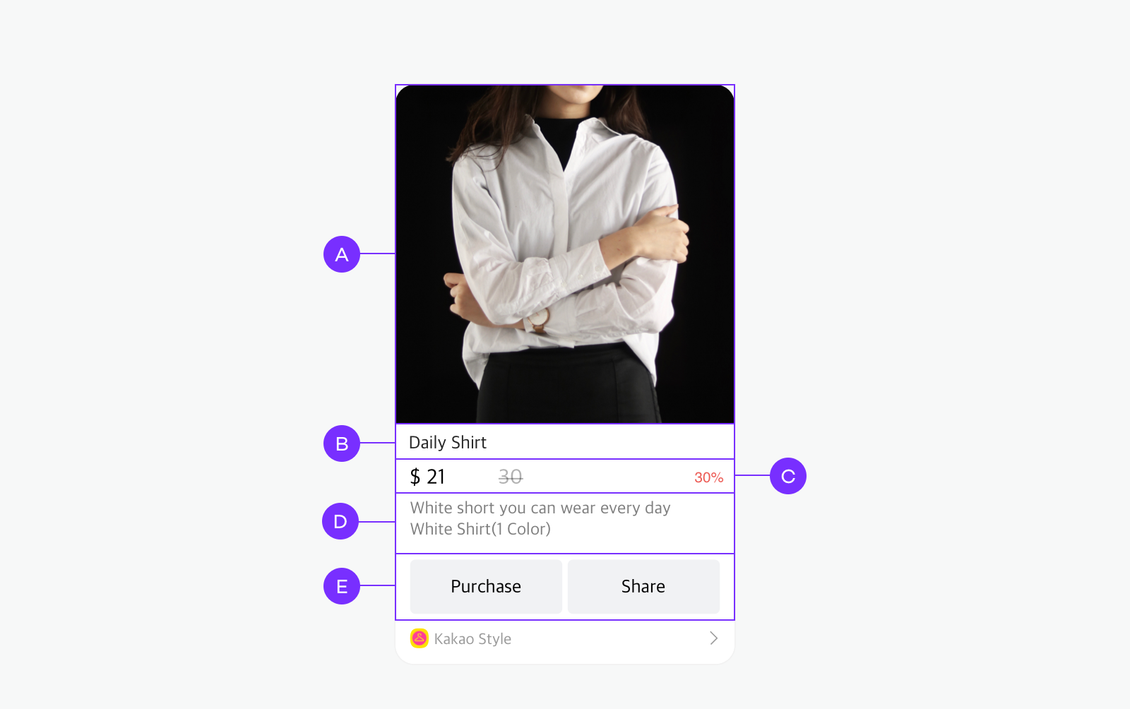
🅐 Image: You can upload only one image with a size of 800x800 pixels or more. 🅑 Product name: Product name. Up to two lines are displayed. 🅒 Product information: Discount price(Possible to change the currency symbol and position), regular price, and discount rate. 🅓 Content: Product description. Up to two lines are displayed. 🅔 Button: You can add up to two buttons. 8 characters or less are recommended for the button name.
template_object (SDK: CommerceTemplate)
| Name | Type | Description | Area | Required |
|---|---|---|---|---|
| object_type SDK: objectType |
String |
Template type. Fixed to commerce. |
- | O |
| content | Content |
Content information of a message. | 🅐, 🅓 | O |
| commerce | Commerce |
Product name and price information. See Commerce. |
🅒 | O |
| button_title SDK: buttonTitle |
String |
Used when you want to change the title of the default button ("자세히 보기"). | 🅔 | X |
| buttons | Buttons[]Android,Flutter: List<Button>iOS: [Button] |
Button list. Up to two buttons are allowed. Used when you want to change the button title and link or to add two buttons. |
🅔 | X |
Commerce (iOS: CommerceDetail, Android,Flutter: Commerce)
| Name | Type | Description | Area | Required |
|---|---|---|---|---|
| product_name SDK: productName |
String |
Up to two lines of product name or title are displayed in black above the product price. | 🅑 | X |
| regular_price SDK: regularPrice |
Int |
Regular price. | 🅒 | O |
| discount_price SDK: discountPrice |
Int |
Discount price. | 🅒 | X |
| discount_rate SDK: discountRate |
IntiOS: NSNumber |
Discount rate. | 🅒 | X |
| SDK: fixedDiscountPrice | Int |
Fixed discount price. You cannot use this with discount rate at the same time. | 🅒 | X |
| currency_unit SDK: currencyUnit |
String |
Currency unit or symbol. (Example: 원, Won, USD, ₩, $) (Default: 원) |
🅒 | X |
| currency_unit_position SDK: currencyUnitPosition |
Int |
Position of currency unit or symbol. 0: Place currency symbol after the price.1: Place currency symbol before the price. (Default: 0) |
- | X |
Text message
The Text template, provided as a default template, consists of a text area and a button. Configure the Text message through template_object. You can add one more button as needed.
🅐 Text: Up to 200 characters are displayed. 🅑 Button: You can add up to two buttons. 8 characters or less are recommended for the button name.
template_object (SDK: TextTemplate)
| Name | Type | Description | Area | Required |
|---|---|---|---|---|
| object_type SDK: objectType |
String |
Template type. Fixed to text. |
- | O |
| text | String |
Text information. Up 200 characters are displayed. |
🅐 | O |
| link | Link |
Link information to be redirected when a content is clicked. | 🅐 | O |
| button_title SDK: buttonTitle |
String |
Used when you want to change the title of the default button ("자세히 보기"). | 🅑 | X |
| buttons | Buttons[]Android,Flutter: List<Button>iOS: [Button] |
Button list. Up to two buttons are allowed. Used when you want to change the button title and link or to add two buttons. |
🅑 | X |
Scrape message
You can configure the content of a website using the images, title, descriptions, and links based on information on the web page and send it simply. When the page is scraped, web page information is collected based on the Open Graph Protocol and used for each component. Therefore, when you request to send a scrape message, you do not need to configure message contents separately, except for the contents to be added to the message template through a user argument.
🅐 Image: A representative image of the scraped web page is displayed.
🅑 Text: The title and description of the scraped web page are displayed. Up to two lines for title and description respectively.
🅒 Button: Button name is displayed as specified for the web page in ${SCRAP_HOST}에서 확인 format. Users are directed to the scraped web page with this button tapped.
Default argument keys used for Scrape message
Because the following argument keys are already assigned for a scrape message, you cannot use these names for an argument key. If the requested web page includes the Open Graph Meta tags, each tag value is applied for each argument key to create a scrape message.
| Key | Description | Area |
|---|---|---|
| ⓐ ${SCRAP_IMAGE} ${SCRAP_IMAGE_WIDTH} ${SCRAP_IMAGE_HEIGHT} |
The representative image of the web page set in og:image. ${SCRAP_IMAGE_WIDTH} is the specified width of og:image, and ${SCRAP_IMAGE_HEIGHT} is the specified height of og:image. |
🅐 |
| ⓑ ${SCRAP_IMAGE_DURATION} |
The music or video duration set in og:music:duration or og:vedio:duration. |
🅐 |
| ⓒ ${SCRAP_TITLE} |
The title of the web page set in og:title. |
🅑 |
| ⓒ ${SCRAP_DESCRIPTION} |
The description of the web page set in og:description. |
🅑 |
| ⓓ ${SCRAP_HOST} |
The name of the web page set in og:site_name. If not specified, the site domain of the requested web page is displayed. |
🅒 |
| ⓓ ${SCRAP_REQUESTED_URL} |
The address of the requested web page. If a user clicks any of the message component, the web page opens. |
🅐,🅑,🅒 |
You can scrape and send only the domains registered in [My Application] > [Platform] > [Web].
Calendar message
The Calendar template consists of an image, text that describes a public event or a subscribed calendar, and a button. You can send a message to encourage users to add a public event or a subscribed calendar to their calendar by using the Calendar template. For more details, see Talk Calendar > Concepts.
To use the calendar template, you need a public event ID or a subscribed calendar ID. To create or manage a public event or a subscribed calendar, you must enable the [Create, retrieve, edit/delete Talk Calendar and events] scope and must obtain permission. See Talk Calendar > Prerequisites.
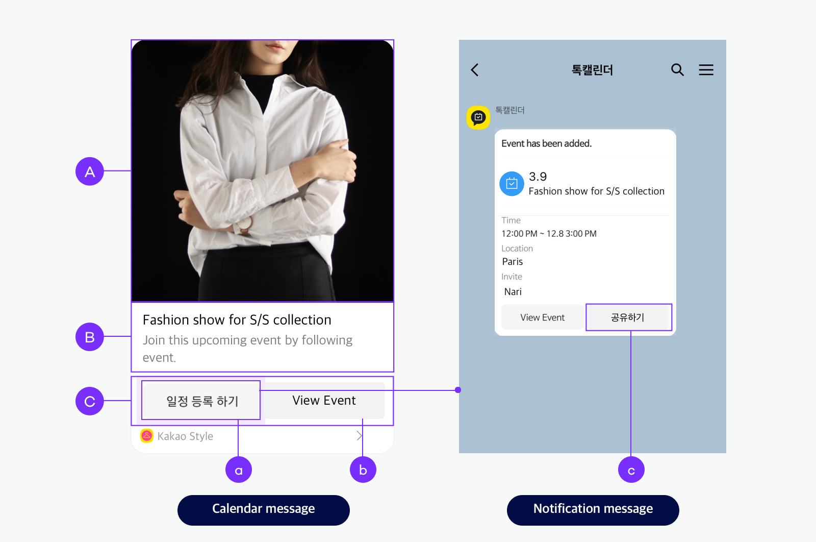
🅐 Image: You can upload only one image. 🅑 Text: The title and description of the calendar or event are displayed. You can enter up to two lines of title and two lines of description. 🅒 Button: You can add up to two buttons, including either [일정 등록하기(Add event)] or [캘린더 구독하기(Subscribe calendar)] button (ⓐ).
template_object (SDK: CalendarTemplate)
| Name | Type | Description | Area | Required |
|---|---|---|---|---|
| object_type | String |
Template type. Fixed to calendar. |
- | O |
| id_type | StringiOS: IdType |
Either event or calendar. Depending on the value of id_type, the button name on a calendar message and how the button works when it is invoked are different. See How a button on calendar message works. |
- | O |
| id | String |
If you set id_type to event, input a public event ID. If you set id_type to calendar, input a subscribed calendar ID in subscribe_{ID} format. |
- | O |
| contents | ContentJavaScript: ContentObject |
Content information about the public event or subscribed calendar. | 🅐, 🅑 | O |
| buttons | Buttons[] JavaScript: Array. Android,Flutter: List<Button>iOS: [Button] |
Button list. Used to add one more button (ⓑ), besides [일정 등록하기(Add event)] or [캘린더 구독하기(Subscribe calendar)] button (ⓐ). NOTE: ⓐ button supports Korean only. |
🅒 | X |
How a button on calendar message works
| id_type | id | Button name | Action |
|---|---|---|---|
event |
Public event ID | 일정 등록하기(Add event) | If a user selects this button in a mobile environment, the public event is automatically added to the user's calendar under the Talk Calendar category. In the web version of Talk Calendar, the page where a user can add the event is displayed. The user can add the event after logging into Talk Calendar. If reminders are set for the added public event, a notification message is sent from Talk Calendar. You can customize the [공유하기] button (ⓒ) on the notification message by setting EventReminder. |
calendar |
Subscribed calendar ID | 캘린더 구독하기(Subscribe calendar) | If selected, the subscribed calendar is added to a user's calendar under the Subscribed Calendar category, and all events of the subscribed calendar are added. This button only works in a mobile environment. |
Common components
content Object (SDK: Content)
| Name | Type | Description | Required |
|---|---|---|---|
| title | String |
Title of the content. | O* |
| image_url SDK: imageURL |
StringFlutter: UriiOS: URL |
Image URL in the content. | O* |
| image_width SDK: imageWidth |
Int |
Image width of the content in pixels. | X |
| image_height SDK: imageHeight |
Int |
Image height of the content in pixels. | X |
| description | String |
Detailed description of the content. Up to four lines including the content title are displayed. |
O* |
| link | Link |
Link information to be redirected to when a a content is clicked. | O |
* One of title, image_url, description is required.
The image included in the content area must meet the following conditions, and you must pass the URL for the image when you request to send a message.
- The image URL must comply with RFC2396, RFC1034, and RFC1123. If not, the image is not displayed.
- The image size must be 200x200 pixels or higher.
- The image file size must not exceed 5 MB.
social Object (SDK: Social)
| Name | Type | Description | Required |
|---|---|---|---|
| like_count SDK: likeCount |
Int |
Number of likes for the content. | X |
| comment_count SDK: commentCount |
Int |
Number of comments on the content. | X |
| shared_count SDK: sharedCount |
Int |
Number of contents shared. | X |
| view_count SDK: viewCount |
Int |
Number of content views. | X |
| subscriber_count SDK: subscriberCount |
Int |
Number of subscriptions to the content. | X |
This object includes social information, such as the number of likes and comments. Only up to three out of five properties are displayed and sorted with the priority: [Like] > [Comment] > [Shared] > [View] > [Subscriber].
button Object (SDK: Button)
| Name | Type | Description | Required |
|---|---|---|---|
| title | String |
Button title. | O |
| link | Link |
Link information to be redirected to when a button is clicked. (At least one is required.) | O |
If the values both for buttonTitle and buttons are given when configuring a message, the value of buttons is applied. When neither value is given, the link information of link on the content object is applied for a button.
link Object (SDK: Link)
| Name | Type | Description | Required |
|---|---|---|---|
| web_url SDK: webURL |
StringFlutter: UriiOS: URL |
The web link URL used in PC version of Kakao Talk. The domain of the URL must match the domain registered on the Kakao developers. |
O* |
| mobile_web_url SDK: mobileWebURL |
StringFlutter: UriiOS: URL |
The web link URL used in mobile version of Kakao Talk. The domain of URL must match the domain registered on the Kakao Developers. |
O* |
| android_execution_params SDK: androidExecutionParams |
String |
The parameter used for the app link URL used in Kakao Talk for Android. If not specified, mobile_web_url is applied. |
O* |
| ios_execution_params SDK: iosExecutionParams |
String |
The parameter used for the app link URL used in Kakao Talk for iOS. If not specified, mobile_web_url is applied. |
O* |
* One of web_url, mobile_web_url, android_execution_params, ios_execution_params is required.
This object contains link information to redirect users when a button or content in a message is clicked. You can set different links for each environment, and each link is applied according to the user's environment where the Kakao Talk app is running. The Web link is applicable in all environments: PC (+Mac), Android, and iOS. The Android and iOS links are only applied to the corresponding platforms.
To apply a link to a message, you must set at least one of the link fields. If you have not set any link field or have set a link but the link is not available on the user's environment where Kakao Talk runs, the link is not applied, or the button does not appear in the message content area.
You must register platforms in [My Application] > [Platform]. If not, the link for the platform is not availble. Even after registering a platform, you must register a link for the platform to apply the link to a button.
How links are applied
This illustration shows which link is applied according to platform or condition.
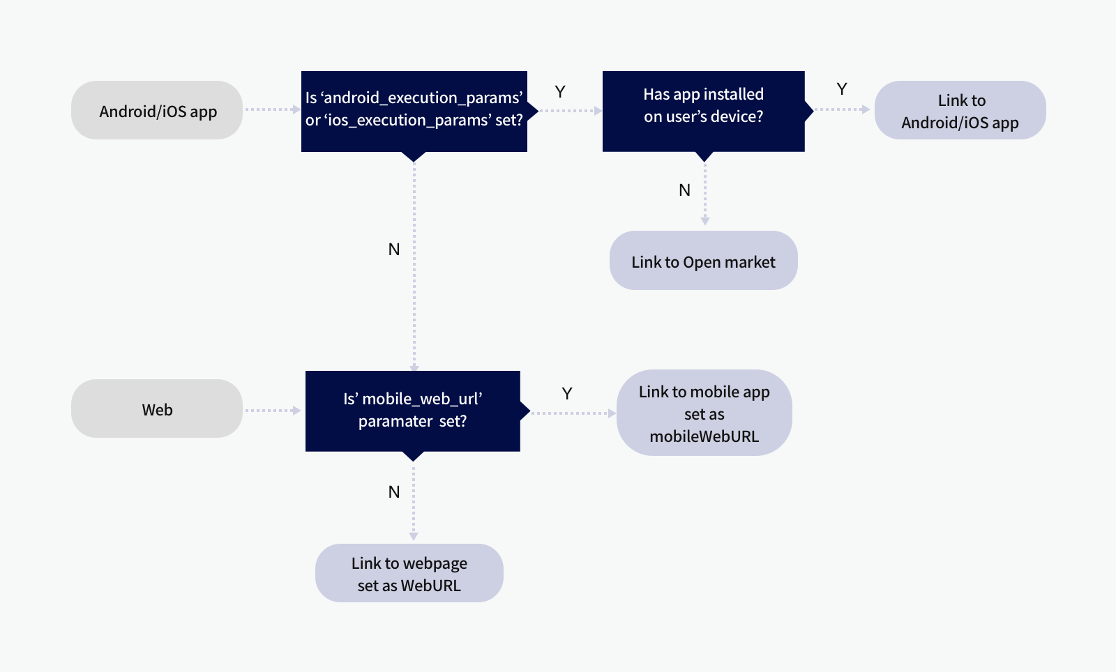
When users click a button or content on a message, users are directed to each link with the following priorities:
- Link to launch app: Opens your service app that is allowed to launch through Custom scheme setting.
- Link to Open market: Directs to Market URL when your app is not installed on a user's device.
- Link to mobile web: Directs to the URL set as
mobile_web_url. If multiple domains are set in the Web platform, the first domain available to land is used as a default among the registered domains. - Link to PC web: Directs to the URL set as
webURL. If multiple domains are set in the Web platform, the first domain available to land is used as a default among the registered domains.
Here are the examples to show the priorities to work the links:
Example 1
| Platform/Parameter settings | Links applied to actual message |
|---|---|
| Platform registered in Common link settings: Web and Android Message link parameter specified in Button link settings: android_execution_params |
Buttons: Displayed on all PC (+Mac), Android, and iOS devices. Links: Android link is applied for Android devices. Web link is applied for PC (+Mac) and iOS devices (Common link). |
Example 2
| Platform/Parameter settings | Links applied to actual message |
|---|---|
| Platform registered in Common link settings: Android and iOS Message link parameter specified in Button link settings: android_execution_params, ios_execution_params |
Buttons: Displayed on Android and iOS devices only. Links: Android link is applied for Android devices. iOS link is applied for iOS devices. |
Example 3
| Platform/Parameter settings | Links applied to actual message |
|---|---|
| Platform registered in Common link settings: Web Message link parameter specified in Button link settings: web_url, mobile_web_url |
Buttons: Displayed on all PC(+Mac), Android, and iOS devices. Links: Web link is applied. |
Example 4
| Platform/Parameter settings | Links applied to actual message |
|---|---|
| Platform registered in Common link settings: iOS Message link parameter specified in Button link settings: web_url, mobile_web_url |
Buttons: Displayed on all PC(+Mac), Android, and iOS devices. Links: Web link is applied. |
Message template builder
You can easily register and modify a custom message as you want in [Tools] > [Message Template Builder]. Register custom templates for each app. You cannot use another app's custom templates when requesting Message APIs. Click [Create template] and choose a type to register a new custom template.
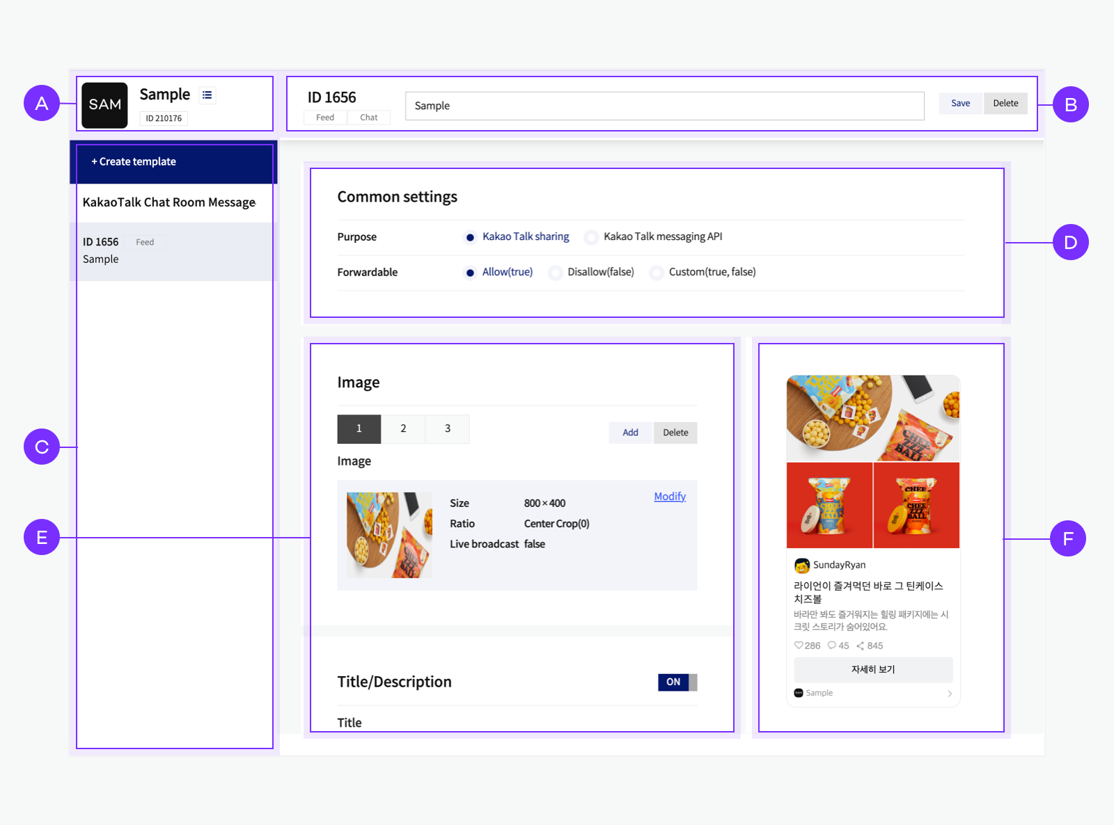
🅐 App information: Displays information about the selected app. Click the list button to choose another app. 🅑 Custom template information: Displays the template ID, name, and types and provides buttons for saving and deleting. 🅒 Custom template list: Displays the list of custom templates of the selected app. 🅓 Common settings: Displays purpose and forwardable options. 🅔 Component settings: Provides settings for each component. 🅕 Preview: Displays the preview according to current settings. Click each part to set the component.
Supported components by type
The supported components for each custom message type are summarized below. You can navigate to each description by clicking the component name.
| Message | Feed | Extended feed | List | Commerce |
|---|---|---|---|---|
| Image | O | O | X | O |
| Profile | O | O | X | O |
| Header | O | O | O | X |
| Image item | O | O | X | X |
| Text item | O | O | X | X |
| Title/Description | O | O | X | X |
| Social | O | O | X | X |
| Item list | X | X | O | X |
| Product | X | X | X | O |
| Product description | X | X | X | O |
| Button | O | O | O | O |
| Component link settings | O | O | O | O |
Common settings
In the common setting, you can set the [Purpose] and [Forwardable] options for the chat bubble.
| Name | Description |
|---|---|
| Purpose | Select which API the message will be used for. Choose one of [Kakao Talk Sharing] or [Kakao Talk Messaging API]. Note: If you use the message only to send to me APIs, set the [Purpose] to [Kakao Talk Sharing]. |
| Forwardable | Select whether to add the forward icon next to the message. [Allow]: Users are allowed to forward the message to the user's friends or a chatroom. [Disallow]: Users cannot forward the message. [Custom]: You can make the message forwardable when requesting. |
Image
Image is a message component included in content. To exclude the image area from the message, delete all images by clicking [Delete].
| Name | Description |
|---|---|
| Image | You can upload up to three images, and each image file size must be 5 MB or less. If selecting [Custom], you can use a user argument and pass the image URL value when requesting to send a message. In this case, up to 5 MB is allowed. |
| Image size | The image is displayed in the message with a size of the width and height specified in this field. You can set the Image size to a minimum of 400px * 400px and a maximum of 800px * 800px. The ratio is a minimum of 2:1 and a maximum of 3:4. |
| Ratio | If you set the Image size, select [Center Crop]. You cannot check the image ratio in the Preview pane even though you set the ratio. To check the ratio, send a test message to see how it actually looks. The ratio doesn't apply to images if you attach more than two images. [Center Crop(0)]: Select this option to align the image to the center of the specified area and display only the specified area from the center except for the rest areas. [Maintain original ratio(1)]: Shows the image in the original ratio within the 1:1 ratio area and fills the remaining space with white. [Custom(0, 1)]: Select this option to set a user argument. Pass the argument value to [Center Crop(0)] or [Maintain Original Ratio(1)] when requesting to send a message. |
| Display image count | This setting is only activated for the third image. For a custom message, up to three images are displayed only, but in the case of a message that includes more than three images, users can see how many more images they can see by clicking the message. You can specify a number up to 3, and then the number of additional images is displayed on the third image in the message, such as [+3]. If you do not want to show the number of additional images, do not enter any number. |
| Live broadcast | Whether to attach the "LIVE" label to the image at the bottom right of the image. You can use this option when sharing a live broadcast as a video or image. |
| Play time | To attach the duration label of the shared video at the bottom right of the image, enter the duration in seconds. |
Profile
Set the profile information that appears between the Image and Text areas. You can make it look as if the person or service of the profile posts the message. You can set a profile only when configuring custom messages. The default templates do not support the profile feature. If you set it to [Disable], the profile is excluded from the message.
| Name | Description |
|---|---|
| Image | Register a profile image. If you upload a profile image, it is displayed with rounded corners. You can only upload a single image with a file size of 5 MB or less. If selecting [Custom], you can use a user argument and pass the image URL value when requesting to send a message. |
| Image size | The profile image is displayed in a small circle with a size of the width and height specified in this field. The input values only affect the image ratio. The maximum image size is 800x800 pixels. |
| Profile name | Enter the profile nickname as you desire. If you set the name too long, it is omitted with an ellipsis(...). |
Title/Description
The title and description are message components included in content. You can only enter up to two lines of title and two lines of description. If you enter more than two lines of title or description, the rest of the texts after the second line are cut off.
| Name | Description |
|---|---|
| Title | Enter the title displayed in black and larger than the description. |
| Description | Enter the description displayed in gray and smaller than the title. |
Social
Social is a message component included in Social. With this component, you can make a message look as if the content has received a lot of attention and response from users. Or you can also reflect the actual number of likes and comments from users using user argument.
Only up to three types of social information are displayed in this area. If you enter values for more than three items, only three items are displayed in this order with the priority: Like > Comment > Shared > View > Subscriber.
| Name | Description |
|---|---|
| Like | Enter the number of user reactions displayed with a heart icon. |
| Comment | Enter the number of user comments displayed with a chat bubble icon. |
| Share | Enter the number of shares displayed with a share icon. |
| View | Enter the number of views displayed with an eye icon. |
| Subscriber | Enter the number of subscribers displayed with a person icon. |
Header
This component is for the List message and the Extended feed message. Only one profile or header is available for the feed(item) type.
| Name | Description |
|---|---|
| Header name | Set the title or description of the message. The Header area in the List message is displayed at the top of the message. In the Extended feed message, The Header area is displayed above the main item. |
Image item
These components are for the Extended feed message.
| Name | Description |
|---|---|
| Title | Enter the title of the image item, which is displayed in bold. Up to two lines are allowed. |
| Category | Enter the description or category of the image item, which is displayed in gray and smaller than other letters. |
| Image | Upload an image of the image item. You can only upload a single image with a file size of 5 MB or less. If selecting [Custom], you can use a user argument and pass the image URL value when requesting to send a message. |
Text item list
These components are for the Extended feed message. You can add a list of the text items and summary information.
You can add text items up to five. At least one item's Title and Description are specified, the Item list is displayed in the message. Only when you set both Title and Description of an item, the item is displayed.
You can add summary information for the items in the Item list. Only when you set both Title and Description under Summary information, the summary information is displayed.
| Name | Description |
|---|---|
| Title | Enter the item name, which is displayed in gray. |
| Description | Enter the item description, which is displayed in black. |
| Summary title | Enter the text that summarizes the item list such as [Total price], which is displayed in gray and bigger than the item's Title. |
| Summary description | Enter the total price or amount, which is displayed in black and bigger than the item's Description. |
| Text alignment | Set the alignment of the descriptions of Item and Summary. You can choose one of [left], [right], [center] and [Custom]. |
Item list
With the List component of the message, you can send a message with a list type that contains several items. You can add up to five items but must add at least one on the list. You must register at least one item on the list.
| Name | Description |
|---|---|
| Title | Enter the title of each item. If you enter too long title, it may cut off. |
| Description | Enter the description of each item displayed in gray and smaller letters than the title. If you enter too long description, it may cut off. |
| Image | You can add a small image at the right side of each item. If you select [Upload image], you can upload up to 5 MB. If selecting [Custom], you can use an argument and pass the image URL value when requesting to send a message. |
| Image size | The input values only affect the image ratio. The maximum image size is 800x800 pixels. |
| Ratio | You cannot check the image ratio in the Preview pane even though you set the ratio. To check the ratio, send a test message to see how it actually looks. |
| Live broadcast | Whether to attach the "LIVE" label to the image at the bottom right of the image. You can use this option when sharing a live broadcast as a video or image. |
| Play time | To attach the duration label of the shared video at the bottom right of the image, enter the duration in seconds. |
| Link settings | If you select [Set individual links], you can specify a link for each item. If selecting [Use common link], the link specified in Common link settings is applied to the links of all items. |
| List ranking | You can use this option when you want to display each item with rankings. If you select [Y], the items in the list are displayed with rankings. You can also decide whether to use rankings by setting it as [Custom] and passing the argument as [Y(true)] or [N(false)]. From 1 to 5 are allowed for ranking numbers for each item, and numbers are assigned in the order you enter. |
Product
You can set the product name and price information for a Commerce message, which is commerce in the Commerce object among message components. The items are sorted in this order: Image > Profile > Product information.
| Name | Description |
|---|---|
| Product name | Enter the product name to be displayed above the price in black. Only up to two lines are displayed. |
| Price | Enter the original price of a product to compare it to the discounted price. It is displayed to the right of the discounted price in gray with a strikethrough. |
| Discount rate | Enter the discount rate to be displayed in red and smaller letters than the price at the most right side of the price information area, which shows how cheap the discounted price is compared to the original price. |
| Discounted Price | Enter the discounted product price displayed at the far left of the price information area. |
| Currency unit or symbol | Enter the currency unit (원, won, dollar), the currency code (KRW, USD), or the currency symbol (₩, $). |
| Currency unit position | Select the position of the currency unit or symbol. [After the price(0)]: Place currency symbol after the price. [Before the price(1)]: Place currency symbol before the price. [Custom(0, 1)]: If selecting [Custom], you can decide the currency unit position when requesting to send a message by using user arguments. |
Product description
You can set the product description of the commerce message, which is description in the Commerce object among message components.
| Name | Description |
|---|---|
| Product description | Enter a product description. Up to two lines are displayed below the price information. |
Button
You can add one or two gray buttons to your custom message. Buttons are used to redirect users to the designated web page or app.
| Name | Description |
|---|---|
| Button alignment | You can select how to align buttons when adding two buttons. If you select [Horizontal], two buttons with a half-width of one button are displayed side by side. If selecting [Vertical], two buttons with the same width as one button are displayed up and down. If selecting [Custom], you can decide the alignment method when requesting to send a message. |
| Button name | Enter the button name displayed on the button. If you enter too long button name, it may cut off. |
| Display | Decide whether to display the button only to the sender, receiver, or both. |
| Link settings | If you select [Set individual links], you can specify a link for each button. To see the priorities and enable conditions of links, refer to Link. If selecting [Use common link], the link specified in Common link settings is applied to the links of all buttons. |
Component link settings
- Common link: Link information to be commonly applied to areas where web pages or app links can be placed.
- Component link: Link information to be applied to a specific component, can be checked and set in [Link details by component].
- Source link: Link information in the app information at the bottom of the message, editable only in custom templates registered with the message template tool, app name and icon cannot be edited.
Common link works differently depending on user environments. And common links can be set dynamically using user arguments. To prevent landing settings from changing dynamically depending on user environment or user variables, set a fixed individual link in the message template.
The following items can be set for each link. Refer to Link for the priority and execution conditions.
| Name | Description |
|---|---|
| Mobile Web | This link is only applied in a mobile web environment. You can set up the settings only after registering Web platform information on the Platform page. [DOMAIN], Select one among the site domains you have registered in 플랫폼. [PATH]: Enter the rest address, except for the domain. |
| Web | This link is only applied in a PC environment. The detailed settings are same as the [Mobile Web]. |
| Android Scheme | Settings for a scheme to launch an app on Android platform. You can set up the settings only after registering Android platform information on the Platform page. [SCHEME]: Automatically created in kakao${NATIVE_APP_KEY}://kakaolink format.[PARAMETER]: Set to pass some values when launching an app. By referring to the passed parameters, you can implement the subsequent processing, such as checking if the user launches the app through a message or redirecting a user to a specific page. Supports User argument. |
| Android Market | Settings for a market URL where users can download your app on Android platform if the app is not installed on a user's device. You can set up the settings only after registering Android platform information on the Platform page. |
| iOS Scheme | Settings for a scheme to launch an app on iOS platform. You can set up the settings only after registering iOS platform information on the Platform page. The detailed settings are same as the [Android Market]. |
| iOS Market | Settings for a market URL where users can download your app on iOS platform if the app is not installed on a user's device. You can set up the settings only after registering iOS platform information on the Platform page. |